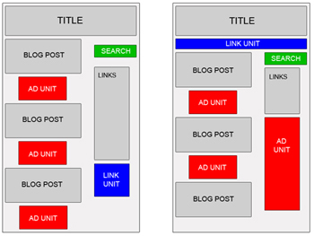
And there is 9 recipes:
- ABOVE THE FOLD, BELOW THE TITLE
Ingredients:- 1 Medium Rectangle (300 x 250) Text Ads or 1 Square (250 x 250) Text Ads or 1 Large Rectangle (336 x 280) Text Ads or Banner (468 x 60) Text Ads
- Place one of the above Google Adsense Ads at the beginning of your article, just right below the title.
- AT THE END OF AN ARTICLE
Ingredients:- 1 Medium Rectangle (300 x 250) Text Ads or 1 Square (250 x 250) Text Ads or 1 Large Rectangle (336 x 280) Text Ads or Banner (468 x 60) Text Ads
- Place one of the above Google Adsense Ads at the end of your article.
- NEXT TO AN IMAGE
Ingredients:- 1 Medium Rectangle (300 x 250) Text Ads or 1 Square (250 x 250) Text Ads or 1 Large Rectangle (336 x 280) Text Ads,
- 1 image (width 190 px, height 280 px) or 4 images (width 60 px, height 60 px)
- First Approach
- Create a table (width = 550), and divide it into two columns.
- Place Google Adsense Text Ads into the left column.
- Place your 190 x 280 image into the right column.
- Second Approach
- Create a table (width = 550), and divide it into two columns.
- Divide the left column into four rows, and place each of your 60 x 60 images into each row.
- Place Google Adsense Text Ads into the right column.
You must place a border or a line between your images and your Ads, so it doesn't violate Google Adsense TOS (Terms of Service).
- BLENDED IN ARTICLE
Ingredients:- 1 Medium Rectangle (300 x 250) Text Ads or 1 Square (250 x 250) Text Ads or 1 Large Rectangle (336 x 280) Text Ads
- Place one of the above Google Adsense Ads into your article body, so it perfectly blends in. You can use this code for that purpose:
- You may choose to make it left or right justified. According to Google Adsense Heat Map, left justified tends to bring the best CTR. But some webmasters said right justified is also working very well.
- RIGHT JUSTIFIED
Ingredients:- 1 Skyscraper (120 x 600) Text Ads or 1 Wide Skyscraper (160 x 600) Text Ads or 1 Vertical Banner (120 x 240) Text Ads
- Divide your webpage into two or three columns (left, middle and right).
- Place one of the above Google Adsense Ads into the left or the right section.
- RIGHT BELOW IMAGES
Ingredients:- 4 images (width 165 px, height 60 px),
- 1 Leaderboard (728 x 90) Text Ads
- Create a table (width = 728) with 2 rows.
- Divide the first row into 4 columns and place each of the images in each column.
- Place the leaderboard text ads in the second row.
- Place this table below your header.
Caution!
You must place a border or a line between your images and your Ads, so it doesn't violate Google Adsense TOS (Terms of Service).
- BELOW THE HEADER
Ingredients:- 1 Link Units (468 x 15) or 1 Link Units (728 x 15)
- Place one of the above Google Adsense Link Units right below your header and match its color with your website theme.
- BLENDED IN NAVIGATIONAL LINKS
Ingredients:- 1 Link Units (468 x 15) or 1 Link Units (728 x 15)
- Place one of the above Google Adsense Link Units right below your header.
- Place your navigational links below or above that Link Units and set their fonts to "Verdana, Arial, Helvetica, sans-serif" 11 px.
- CAMOUFLAGED AS NAVIGATIONAL LINKS
Ingredients:- 1 Link Units (468 x 15) or
- 1 Link Units (728 x 15)
- Place one of the above Google Adsense Link Units right below your header and make it looks like your navigational links.

No comments:
Post a Comment