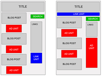
Adsense Placement is always researched and tested to find out the best place for Webmaster and Visitor. Most of Webmaster followed Google Adsense Guides to put adsense on their website. And most of them are right.
According to Google:
While this heat map is useful as a positioning guideline, we strongly recommend putting your users first when deciding on ad location. Think about their behavior on different pages, and what will be most useful and visible to them. You'll find that the most optimal ad position isn't always what you expect on certain pages.
For example, on pages where users are typically focused on reading an article, ads placed directly below the end of the editorial content tend to perform very well. It's almost as if users finish reading and ask themselves, "What can I do next?" Precisely targeted ads can answer that question for them.
For example, on pages where users are typically focused on reading an article, ads placed directly below the end of the editorial content tend to perform very well. It's almost as if users finish reading and ask themselves, "What can I do next?" Precisely targeted ads can answer that question for them.
But, I have 2 new ideas, ONLY my thought, and I think they're right, you can try to test these:
1/ Put Adsense in Left Sidebar or Right Sidebar: with Google, left is better right. But, let's think!
- When visitors browse your site, they will look thing which are on the left side, TOP LEFT side, that is the FIRST thing people see (Based on Golden Triangle Google). HOWEVER, they just only SCAN it, SCAN it and forget it.
- And when an ads appears on the right sidebar, in the first time, they almost won't realize it, it, but when you can make it appear “differently” with the rest, that means, after scan the page, they will notice that ads, and they not just scan, they “read” the ads, and they will easily more click the ads,…
Of course, you must choose Adsense format fits with your template, let see Which Adsense ads format is the best? for more informations.
That's just a little tips, but I found it work well for me and my friends.
Example for right sidebar Ads:
Please read 15 Effective Tips to Increase Google Adsense CTR for more informations.
2/ Should you put ads in first page (Home page)? I found that it is better not to put ads in index page! Why?
Almost Webmasters think that putting ads as much as possible is better for get more clicks. But you think, if visitors come to your site with main keyword, and although first page has lot of contents, they maybe click on ads and leave your site. Maybe leave FOREVER, if they find ads page is helpful, and they will forget your site.
If the first page has not any ads, just content, they just read the content, and visit second, third pages to read more. They will "notice" more with ads, and they maybe "read" ads, not "scan", and if they click on ads, they still remember your site to come back.
Alright? Not believe? Just try it! So you just need to decide, which side is good for you. You can try to change the ads position for several days and check the difference. For the combination of left and right positions for ads, I think a lense page in Squidoo.com did it well.


No comments:
Post a Comment